
Single Cell RNA-seq Analysis
Visualize and Interact with your Single Cell Data

Visualize and Interact with your Single Cell Data
Basepair’s scRNA-seq pipeline is fast and built on the best peer-reviewed tools available. All steps of the pipeline – from alignment, expression quantification, to clustering and visualization – are entirely automated.
Reports and visuals are crucial to single cell RNA-seq analysis; however it can be a pain to set up. That’s why Basepair includes a host of rich visual and interactive components as part of the interactive report that is generated every time you run the pipeline.
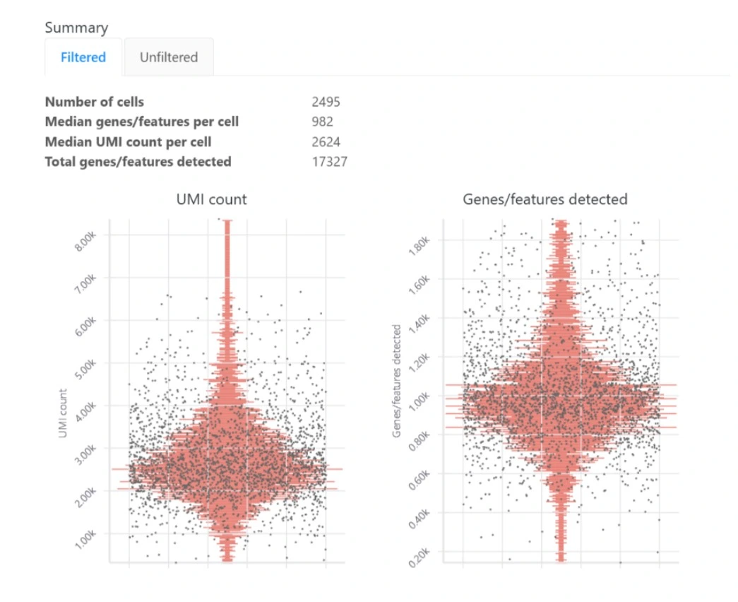
Basepair’s single cell RNA-seq analysis report includes boxplots that show the per- cell quality metrics.
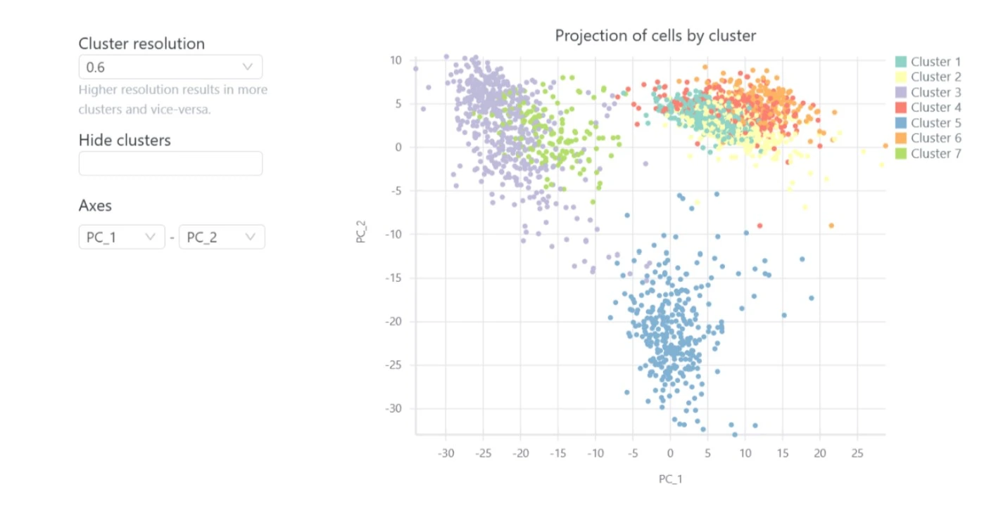
Included in the interactive single cell RNA-seq analysis report are clustering and visualization with t-SNE, UMAP and PCA plots.
This groups your cells into biologically meaningful clusters, where each cluster usually corresponds to different tissues or cell types. You can then visualize the expression of particular genes across the clusters. This allows you to identify a cluster as corresponding to a particular cell type based on its known gene markers.
The differential expression tables show genes that are uniquely up- or down- regulated in each cluster of the t-SNE and UMAP plots. The analysis compares each cluster of cells to all other clusters, outputting log2 fold change, p-value, and adjusted p-values for each gene. Particularly useful metrics here are the log2 fold change and adjusted p-value. They indicate the magnitude of the gene’s expression change and reduce the chance of a false positive, respectively.
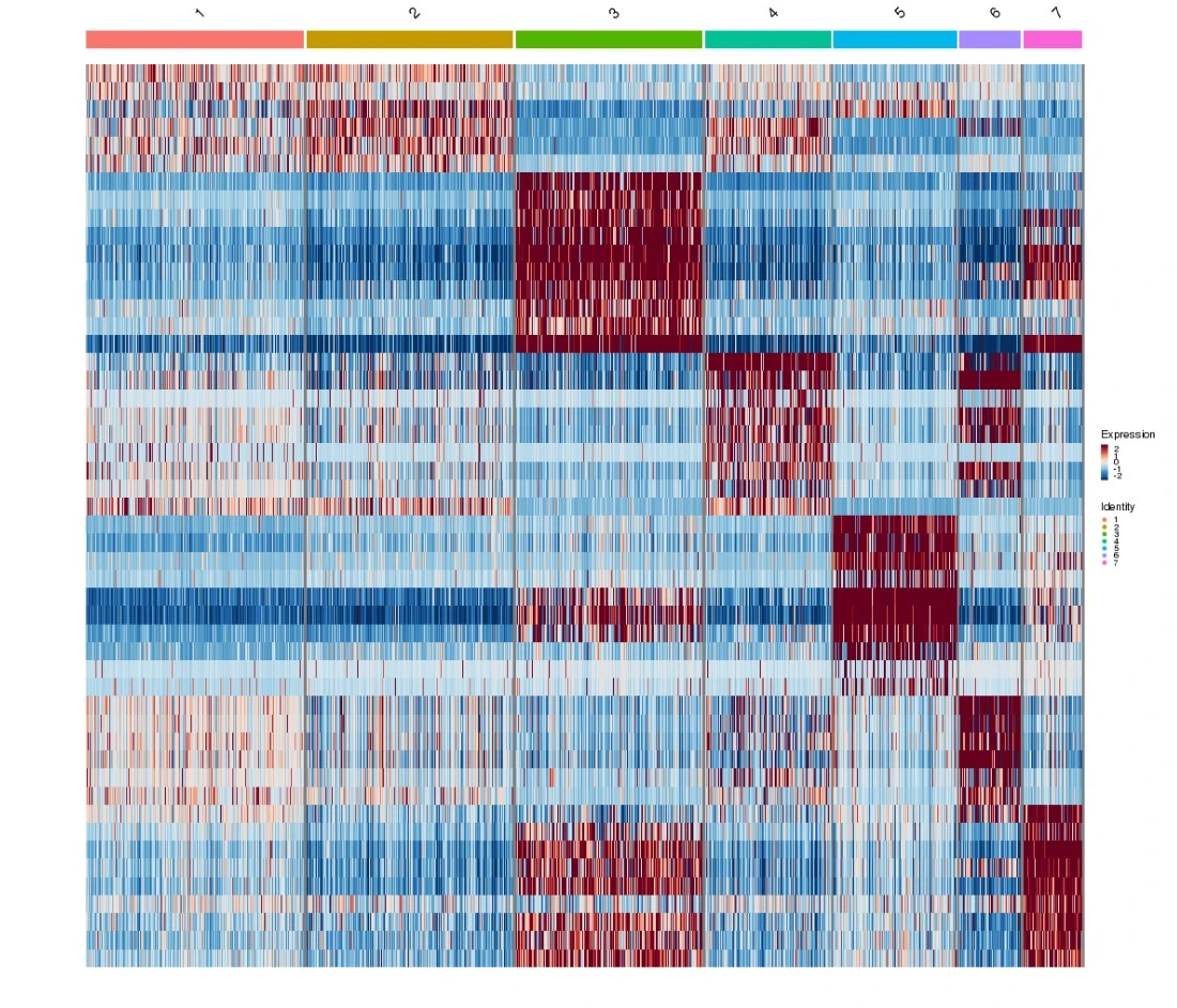
The scRNA-seq analysis report includes a heatmap that visualizes the top 10 most up-regulated genes for each cluster in the t-SNE and UMAP plots. Its main purpose is to visualize the discriminatory power of the selected genes to separate the clusters. An additional useful feature of the heatmap is that it can highlight clusters that are not easily distinguishable from each other but may correspond to the same cell type.
Want to try these features for yourself? Try Basepair’s free 14-day trial, put yourself in the driver’s seat and automate your scRNA-seq analysis process with Basepair. Contact any of our Sciencewerke representatives at [email protected] or call +65 6777 1045 today.